Sunday, July 26, 2015

Silkscreening t-shirts for a Pokémon birthday

For my son's 7th birthday party, I decided to silkscreen t-shirts for all the guests to take home with them. Archer is really into Pokémon right now, so he and I looked through several books to find the right Pokémon character for our tees. We finally agreed on Fletchling. It's a cute, typically-peaceful Pokémon, and I felt it could be simplified fairly easily.

After I received my Speedball Fabric Screen Printing Kit and my t-shirts, I procrastinated for several days before even opening the packages. I haven't attempted a silkscreen print since the 90s, and I don't remember ever using drawing fluid, so I was pretty nervous about the results.

Eventually, I brought out the screen, and sketched Fletchling onto it with pencil. Then, with as steady a hand as I could muster, I painted with the Speedball Drawing Fluid. It looked like this:


After the drawing fluid dried completely, I squeegeed on the Speedball Screen Filler....
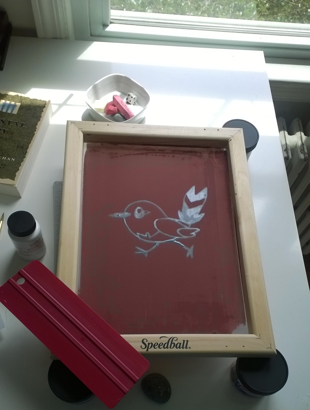


After the filler dried, I rinsed the screen under cool water, which dissolved the drawing fluid, and I set it out to dry again:


It came out okay, but, as you can see, there was screen filler in his eye, and the filler had also bled into the top of his beak and wing (I'm assuming my drawing fluid was too thin). With a cotton swab and detergent, I scrubbed the screen filler out of these areas, and then touched up the edges with screen filler and a paintbrush.

Once that dried, I was ready to print. I stuffed a piece of waxed paper inside each t-shirt to prevent the ink from bleeding through. I then laid the screen on top of the tee, added a thick line of fabric ink at the top, and my son squeegeed the ink across the screen and onto the shirt.

It was a fun process to do together, and we ended up with about 30 tees that looked like this:


Overall, it was a success. The kids seemed to like them a lot, Archer and I were able to create something together, and I tried a new art process.

Have questions or suggestions? Your comments are always welcome!

Thursday, July 23, 2015

Loving my new Copic marker

I thought I'd forever be a Pigma Micron and Sharpie marker person, but I've found a new love: the Copic sketch marker. The brush side moves so smoothly on the paper that it feels like it's leading my sketches. I've found myself drawing a lot more the past few days...


Sketching in the car, while waiting to pick up the kid at camp

Bird sketch, merely because I saw the Copic marker and I couldn't not pick it up


Floral sketch to warm up for summer school class


Monday, July 20, 2015

Geometric Patterns for summer school 2015

As I wrote in my last post, I'm taking another Make it in Design course with Rachael Taylor this summer. My previous post was about my intermediate track submission, but I also submitted to the advanced track.

The advanced assignment focused on "Past Modern," with keywords like ornate, ornamental, geometric, and laser cut. Although I initially spent my time drawing floral elements (which I've done plenty of in the past), I decided to try some geometric shapes in Illustrator, and I ended up with a whole new group of work that I really enjoyed creating.

Below are several of my new patterns, both ornate/floral and geometric (this top one was what I'd submitted for the final online gallery)...


Friday, July 17, 2015

Summer school with surface patterns and design, intermediate track

I am again taking summer school with Rachael Taylor's Make it in Design (I took the course last year as well and blogged about it here and here). Since it's only a couple assignments, I enrolled for both the intermediate and the advanced tracks this time.

For the first intermediate assignment, we worked with an "organic decay" theme. I love rusty and chipped textures, and I use them in most of my collages, but I'd never really considered creating printed textiles with them.

I tried a few different styles, but I submitted this rusty orange one on top. Although I'd be more inclined to wear the black-splash texture below it, I felt the orange would stand out more as a thumbnail in the online gallery.

I'd love to hear what you think. Comments are always welcome.


Tuesday, July 7, 2015

Editorial illustration for Girls' World magazine

My editorial illustrations for Girls' World magazine are now in stores! I am beyond thrilled. I love the story by Sona Charaipotra, the images look great in print, and working with the art director couldn't have been better. It was an excellent first experience in editorial illustration, and I look forward to many, many more.


Wednesday, July 1, 2015

Illustrations for M Delish Boutique's new Sauces

I've been illustrating one of my favorite foods this week for M Delish Boutique's new sauce labels: peppers. I LOVE peppers.

Here are my latest creations for her pepper sauce labels, Chipotle Adobo and Red Tsunami...


Monday, June 22, 2015

Editorial illustration for the "Digital Nomad"

June was our final month for Lilla Rogers' Make Art That Sells Bootcamp, and the assignment was to create a 7x10 horizontal illustration for the article, "How To Succeed At Becoming A Digital Nomad" by Tanya Mohn.

I wanted this one to be simple and graphic, and I went with a silhouetted style to show the layers of landscapes that a digital nomad has the freedom to work in...